Basecamp Brand
Crafting the
Basecamp: Redefining Outdoor Exploration
Basecamp is more than a brand—it’s a movement empowering everyone to embrace the outdoors with confidence and ease. By combining expert knowledge, inclusive tools, and an innovative spirit, Basecamp simplifies adventure planning while inspiring a deeper connection to nature. The brand stands out for its commitment to sustainability, its approachable yet modern tone, and its ability to create a supportive community for outdoor enthusiasts of all levels. Whether you’re a seasoned trekker or a first-time camper, Basecamp makes every adventure unforgettable, approachable, and effortlessly cool.
Making of the Brand
The Vision Behind Basecamp: Basecamp is built on the belief that the outdoors should be accessible to everyone. The brand was designed to inspire confidence and foster community while promoting sustainability and inclusivity. Every decision, from its visual identity to its tone of voice, reflects its mission to empower outdoor enthusiasts with tools, knowledge, and inspiration to embark on unforgettable adventures.
Design Language: Basecamp’s visual identity blends modern aesthetics with the organic beauty of the natural world. The design features a bold, vibrant color palette inspired by outdoor landscapes, geometric shapes for structure and clarity, and customized Google Material Icons for functionality and simplicity. This seamless integration of elements creates a brand that is approachable, forward-thinking, and visually striking.
Crafting an Identity: Developing Basecamp’s identity involved a thoughtful balance of design and purpose. Topographic graphics were introduced to reflect the spirit of exploration, while human-centric photography adds authenticity and connection. Typography—anchored in Roboto Mono—ensures clarity and modernity. Every element was intentionally crafted to tell a story of adventure, community, and sustainability.
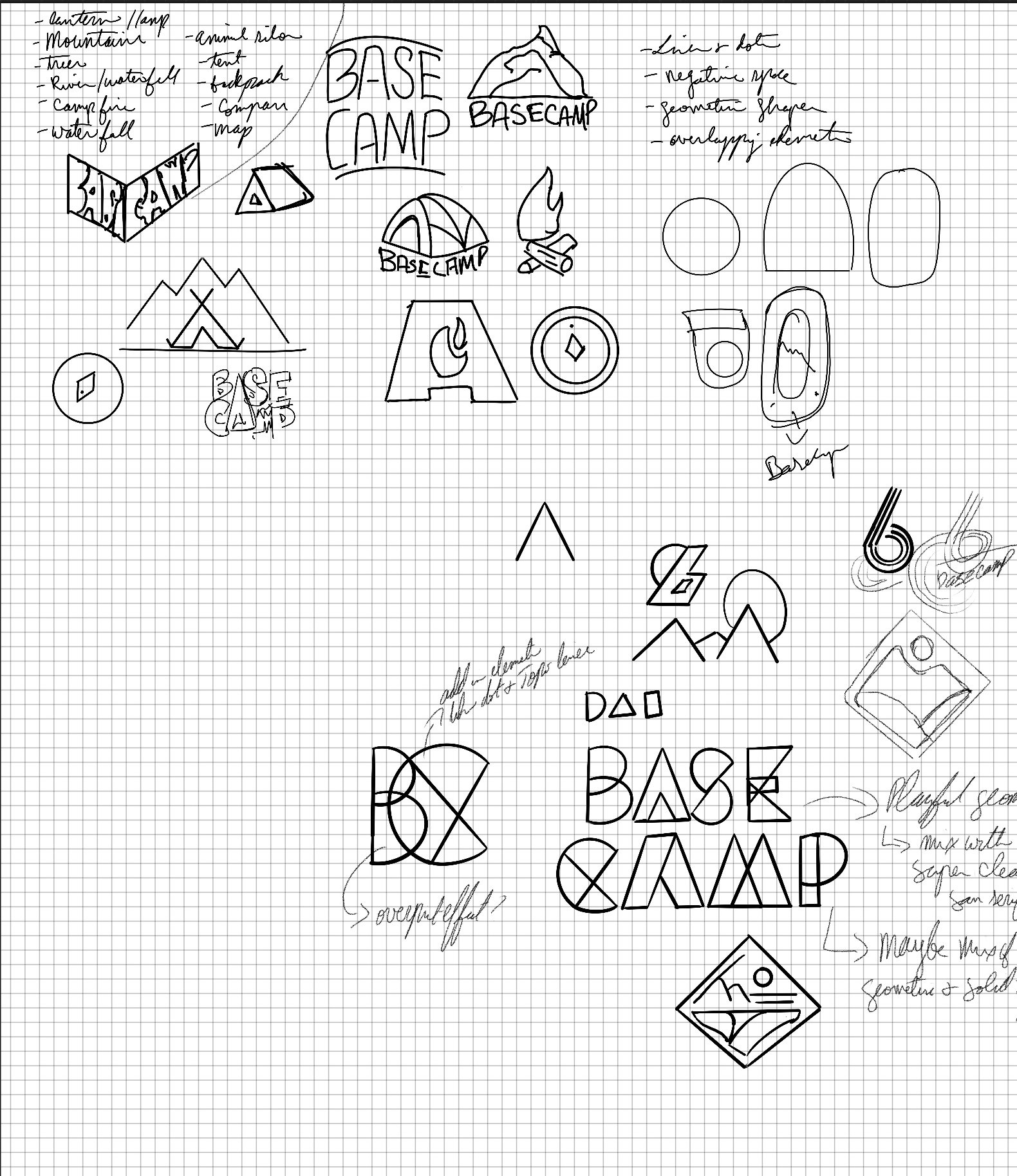
The journey to Basecamp’s logo began with exploration—of shapes, colors, and concepts. Initial sketches experimented with ideas of badges, crests, and monograms, all inspired by the outdoors. The use of overlapping geometric forms symbolized connection, while bold colors added vibrancy and energy. Through iteration, the logo evolved into a striking visual identity that reflects the brand’s adventurous spirit and modern aesthetic. Each design decision—whether incorporating iconography or leaning into dynamic typography—was driven by the desire to create a logo that feels both timeless and innovative, perfectly embodying Basecamp’s mission.
From Sketches to Identity: The Evolution of the Logo
The culmination of countless iterations and explorations, Basecamp’s final logo captures the essence of the brand with bold shapes, clean lines, and a sense of adventure. The primary logo combines geometric forms with playful details, like the star in the “A,” symbolizing guidance and exploration. The standalone icon—a simplified mountain silhouette paired with a guiding star—serves as a versatile mark, perfect for digital and physical applications. Together, these elements form a cohesive identity that is as timeless as it is modern, embodying the spirit of discovery and community at the heart of Basecamp.
The Final Identity: Bold, Adventurous, Timeless
Primary Logo
Icon
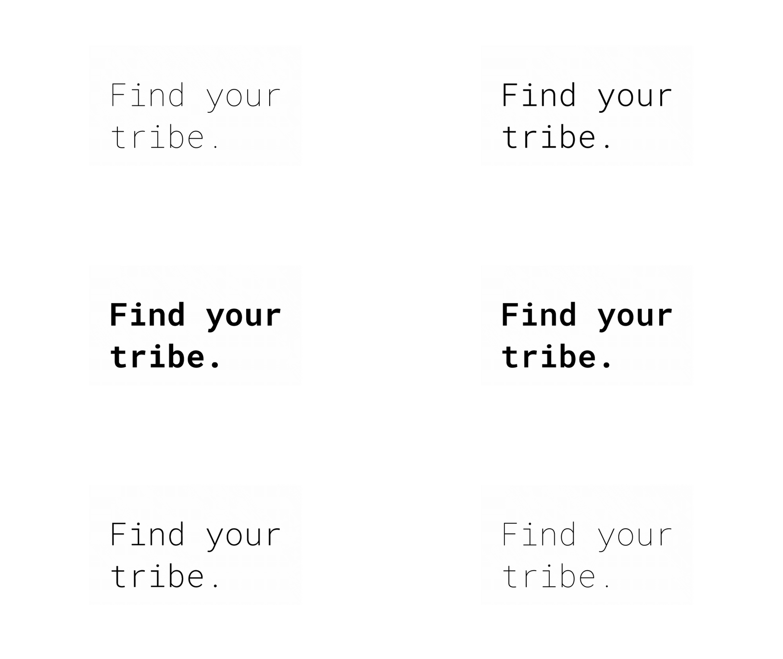
Basecamp’s typography is grounded in Roboto Mono, a monospaced font that merges clarity with a modern, tech-inspired edge. Its clean lines and balanced structure embody the brand’s forward-thinking and approachable identity, making it as functional as it is visually striking. Paired with bold layouts and vibrant colors, Roboto Mono reinforces Basecamp’s adventurous and innovative spirit. It’s a typeface designed to guide explorers with confidence and style.
Roboto Mono: A Typeface That Speaks Adventure
Leveraging the Google Material Icons library, these icons were thoughtfully adapted to align with Basecamp’s modern aesthetic. Minimal adjustments were made to enhance usability while maintaining the library’s clean and approachable design, perfectly complementing the brand’s vibrant and adventurous identity.
Icons That Guide the Journey
The topographic graphics are a nod to the contours of the natural world, symbolizing exploration and discovery. These dynamic, flowing lines add depth and movement to Basecamp’s visual identity, grounding the brand in the landscapes it seeks to celebrate. Simple yet impactful, they seamlessly connect the modern aesthetic with the timeless beauty of the outdoors. Versatile in application, these graphics extend beyond decorative elements; the fluid shapes also serve as containers for imagery, as seen in creative layouts that bring photos and designs to life with an adventurous edge.
Topo Graphics: Mapping the Spirit of Adventure
Basecamp’s color palette bridges the beauty of the outdoors with playful, retro-modern aesthetics. Vibrant tones like Bright Blue and Lavender contrast with earthy Navy and subtle neutrals like Light Grey and Off-White, creating bold, high-contrast visuals that feel reminiscent of early 2000s internet design. This flat, polished look ties seamlessly with Basecamp’s innovative, adventurous spirit, appealing to millennials and outdoor enthusiasts who appreciate a mix of nostalgia and modernity. It’s a palette as dynamic and engaging as the adventures it inspires.
A Palette That Blends Nature and Nostalgia
Basecamp’s geometric shapes are more than design elements—they’re symbols of adventure and connection. Each shape carries a deeper meaning rooted in the outdoor experience:
Circle (Navigator): Represents guidance, exploration, and finding your path, like a compass.
Square (Gather): Evokes the sense of community and connection, inspired by people gathering around a campfire.
Triangle (Shelter): Symbolizes protection and preparation, like a tent providing rest on a journey.
X (Marker): Marks a destination or signifies personal progress and achievement, like a spot on a map.
Together, these shapes form the foundation of Basecamp’s visual language, uniting storytelling with design to inspire every explorer.
Shapes That Tell a Story
Basecamp’s photography tells a story of exploration, connection, and the beauty of the outdoors. With a focus on natural lighting and vibrant colors, every image celebrates the joy of adventure, from candid campfire moments to breathtaking landscapes. The direction is human-centric, showcasing diverse individuals and groups to emphasize inclusivity and community. Clean compositions and dynamic angles create a modern yet timeless aesthetic, while subtle retro elements, like warm tones and grain, evoke a sense of nostalgia. Each shot is designed to inspire, inviting viewers to step into the adventure and make it their own.
Photos That Capture the Adventure
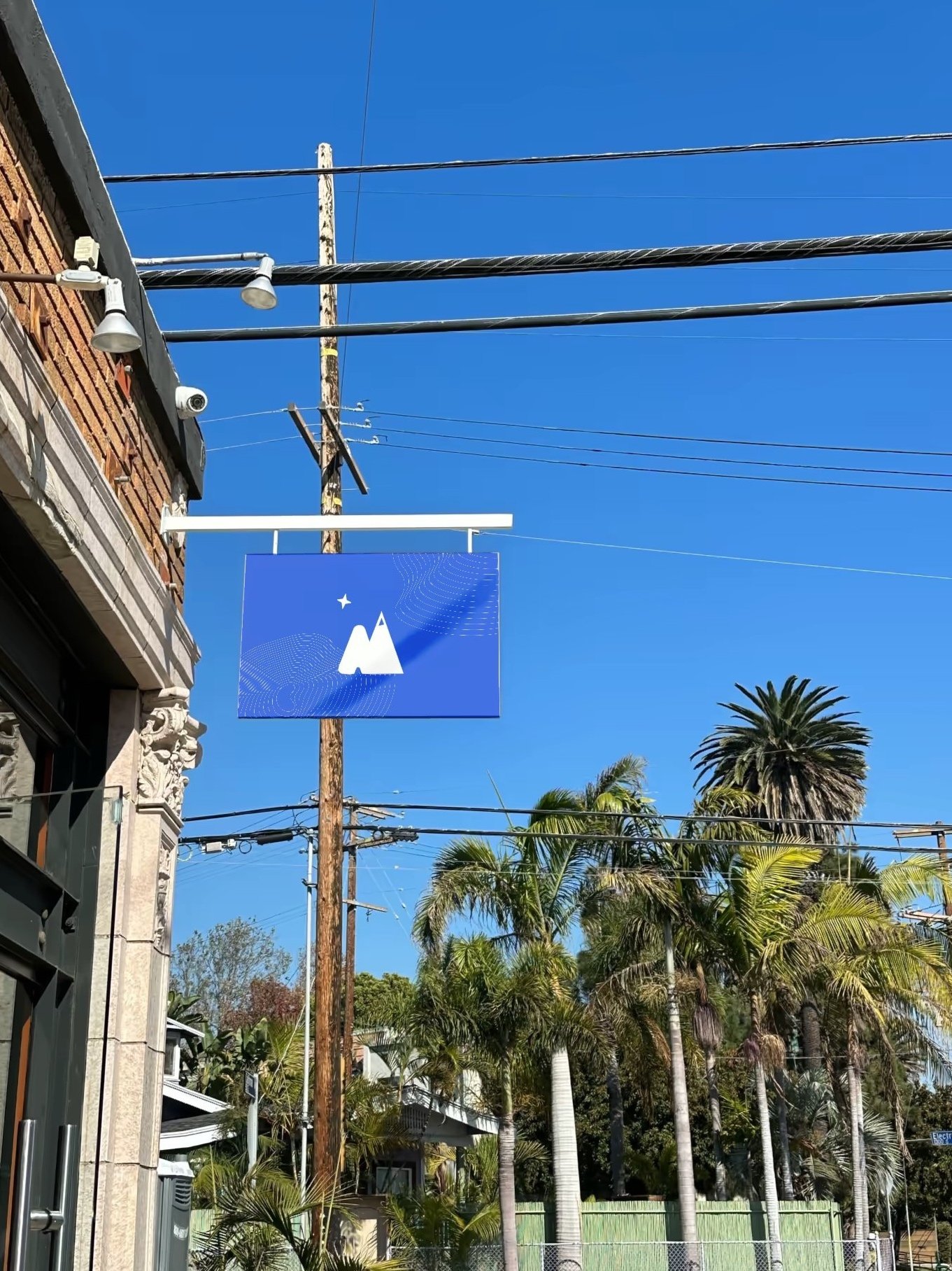
The versatility of Basecamp’s identity comes to life in real-world applications. From wearable merchandise like shirts, hats, and tote bags to environmental settings like bold street posters, the brand seamlessly adapts to every context. With its clean typography, vibrant colors, and iconic graphics, Basecamp leaves a lasting impression, whether on a bustling city street or in the great outdoors. The app further extends the brand’s ethos, blending intuitive design with dynamic visuals to guide users through their adventures.
Basecamp in Action: From Gear to Screens
*Images used for illustrative purposes only. All rights reserved to original owners.


